There you go @DevilinPixy I think you wanted to try the ETARC at the top with your concept though I had to use my portal as I just couldn’t bear drawing another one I didn’t have handy. I’ve used the four pointed stars to show a bit more of the background following @Wyo 's comment. With the ETARC at the top you can get the glyphs in there instead of the stars you had. It looks great small too with the bold font you have chosen. Whichever final design is voted on it can be refined to be perfect!!!
Nothing like a bit of ‘Russian electioneering’!!! I see people swinging votes lol
Having ETARC at the top was actually something @Mad-Hatter suggested. I had already prepared some changes, but didn’t want to show them during the poll and depending on the outcome. I believe a winner has already been decided on, see the discussion below:
Oh! I didn’t know. There’s been soooo much grea t stuff to read on this forum and with Waking Titan it’s been hard to keep up. Glad it’s all sorted at last!!
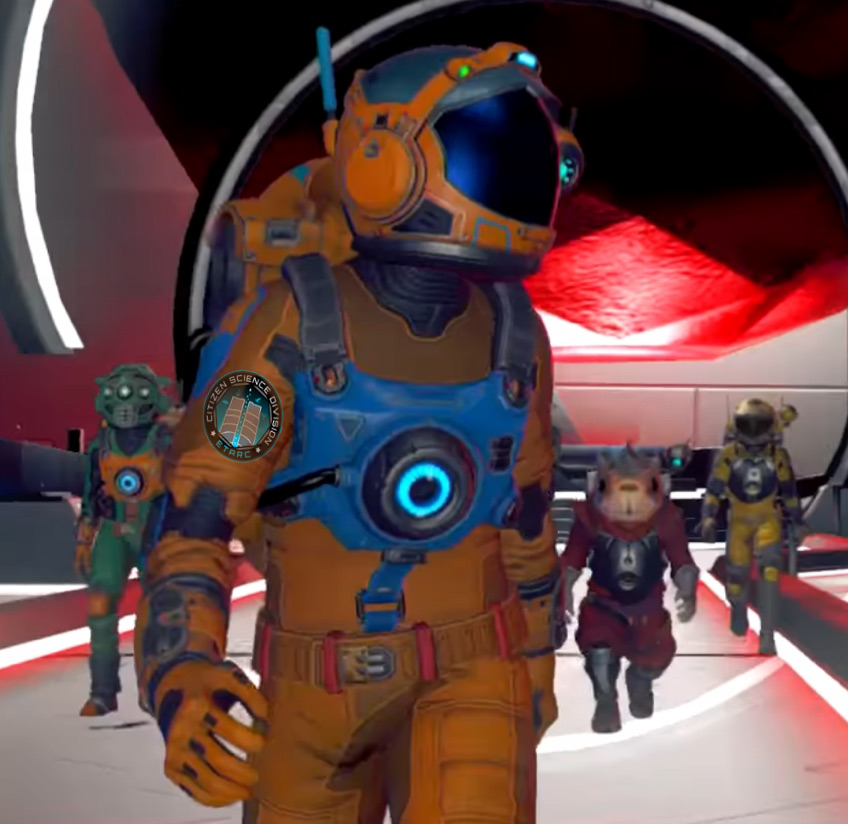
A slot for a customised personal decal or ship badge. Decals to collect and find, left by travellers scattered or torn off in conflict across the galaxies. I must suggest that to Hello Games The pitch … 'What we need is something like a Star Wars bubble gum card to swap and find. NMS bingo lol
If you’re NEW within the last couple weeks, WELCOME! & greetings.
Otherwise, you might remember me.
FIRST UP, I’d just like to say, I’m a little sad to have missed the opportunity to Vote,
HOWEVER
I’ve since (caught up on, and) seen in the Logo discussion thread, the “further work” which came after this poll’s vote leader, and I’m of the most humble opinion that it’s better than the one grabbed for the poll.
I’d like to “give my own props” to @chelofellow for ALL that work…
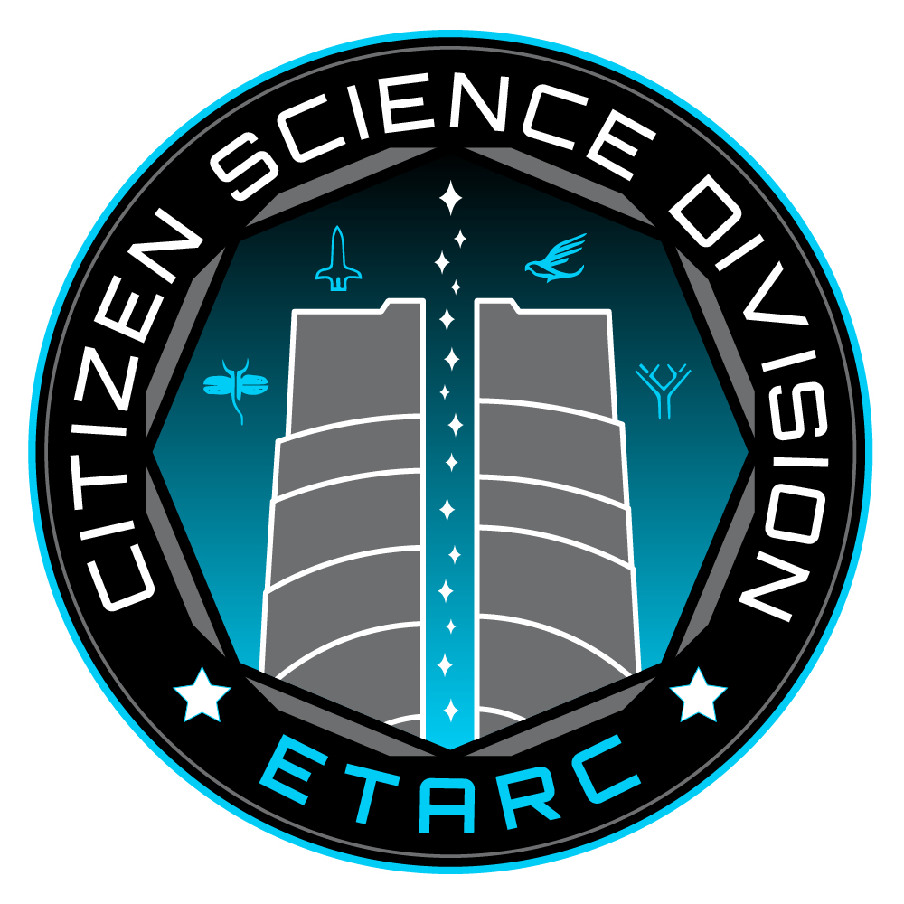
Here’s the post AND (final?) logo to which I refer:
++ “ETARC” – harks back to this forum’s early days, respects “senior” members
++ “Citizen Science Division” tells it like it is; newer joiners to the forum should realise it’s NMS-related
++ 4 GLYPHS present == Portal “address” suffix for the region == identifying, without giving it all away
++ “Star Chain” – 16 is a fabulous (4-squared!) number, reflected in the “outermost” inner border (ie around the similarly-excellent 8-sided badge-centre frame), AND in (the original plan for) the Star Chain (Now 15 stars)
++ PORTAL imagery – simply, that this “group” / community is formed with a Portal (& address) and its associated community-built bases as a Foundation of the in-game ETARC “family”, for all the Explorers & Pathfinders & Travellers, and all who have followed through Atlas Rises, to see what’s coming NEXT.
++ Final comment – I love the colour selection.
… and there you go.
Mister Verbosity strikes again. x x
PS –
Personally, I’d love to see an alternate choice, where the “ETARC” sits at 12 o’clock,
and “Citizen Science Division” spans the 2 - to - 10 o’clock larger arc.
… but that’s just me.
Looking forward to that end result, friend @chelofellow! Thanks, always, for your tireless work!
Work that comes from Passion, seems to win out most frequently.
I, for one (amongst many, I’m sure!) am GRATEFUL to you!
Final Q for you:
Would you submit the “ETARC-top” version as “official Final-final” logo? Or await Senior Members’ (ie labelled “Leaders”) and/or larger ETARC community support for this small change (from “ETARC-bottom” version)?
HOW might we Go Forwardactually using this “final”, beautiful, all-inclusive Logo?
Perhaps a 5-line-high miniature, to cap the Original Posts of all “formal” / group Threads?
Perhaps a 2-3-line-high mini-miniature, to form the basis of a “.sig” section?
How might we “use it more” so that it’s seen in more places, so that newer Forumites can see (and maybe even ask about) it?
It’s great to “finally have a Logo”… now what will we DO with it? x x x
[edit]
'Final' logo (full size) by @chelofellow // QuickDirectLink


